Piyush
—Designer
Perfecting the
Fact Finder
In 2012, forms and tables were the backbone for presenting large sets of data. However, by 2018, this magic had faded—users no longer wanted just raw data. They expected systems to offer insights, contextual guidance, and actionable narratives to make informed decisions effortlessly.
I was part of an ambitious project to redesign the Investor Profile/Fact Find experience for one of the leading financial research company of Australia.
To comply with my non-disclosure agreement, I have omitted and obfuscated confidential information in this case study. All information in this case study is my own and does not necessarily reflect the views of Morningstar.
Background and Problem
Users were walking away — and the Fact Finder was part of the problem.
Imagine being a financial adviser who knows everything and nothing at once. All the data’s there but buried in cluttered forms and static tables. You spend hours digging, even after paying for a premium tool. The cost? Time, trust, and client confidence. Reflection of the promble can be seen in numbers:
Conversion rates dropped from 8% to 1%.
From 5,083 users in 2018 to a loss of 1,200 users annually—by 2020, the system’s shortcomings had cost us 3,600 users.
1.1k+ support tickets/month, many tied to form confusion or data gaps
SUS Score: 48.6 (well below usable threshold)
NPS: -9.8 in 2020, signaling declining trust and satisfaction
Clunky, slow, and outdated —users struggled with complex tables, frustrating load times, and a system that couldn’t keep up with their needs.
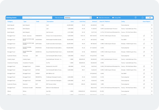
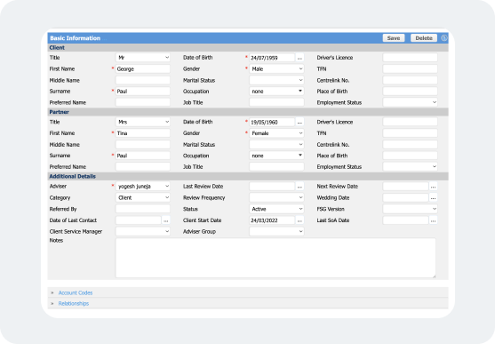
But what is Fact Finder?
Fact Finder helps financial advisors truly understand their clients— gathering key details on their finances, goals, and risk appetite, so they can provide smarter, more personalized advice.
The Challenge
Make It Usable Again in 6 Months
Our goal was to realign with user needs and design a best-in-class experience. From data entry to surface with critical information with real-time insights should happen in no time. Our high level goals were to:
Make it fast and easy to use for everyone.
Empower users to deliver precise advice, work efficiently, and make confident decisions.
Create a platform for deeper engagement.
My Role
I led the design of investor profile/factfind between Nov 2019 to End of 2020. My cross-team was formed by amazing and talented people, including Atul Kumar as Product Manager, Ken as SME, Neha, Ishant, and Devesh as developers, Neha Kumari as QA engineer, and Kulesh as Tech lead.
I was very well supported by the design community of Morningstar. The tool launched in December 2020.
I am still part of this team as a part of continuous discovery process.
My key responsibilities were:
Conducting workshops and interviews to gather requirements and insights.
Establishing the success matrix of the project.
Conceptualising, designing, and testing the solutions.
Communicating and collaborating effectively with stakeholders and the project team at each and every step of the process.
The Kick off
Picking up the pieces
Without pre-existing insights, I partnered with our product and SMEs team to explore how advisers were getting around.
We tested the existing tool with 6 participants and collected different survey results. Our goals were to understand the needs & challenges our user faced.
Early Insights

Numbers were bad
The SUS, NPS and support queries made it clear—this product was a blocker, not a helper. One user put it best: “Your UI means "Ultra Irritating."
Client engagement was suboptimal
Advisors struggled to engage clients because the tool relied on dense, text-heavy data instead of visual insights."
Updating data was cumbersome
Collecting and updating data felt like a chore. Without a user-friendly way to prompt updates, engagement dropped, and operational challenges grew."

Issues with compliance
Compliance became a challenge as outdated or incomplete data made it harder to meet regulatory requirements, increasing risk for advisers and firms."
Deeper Insights
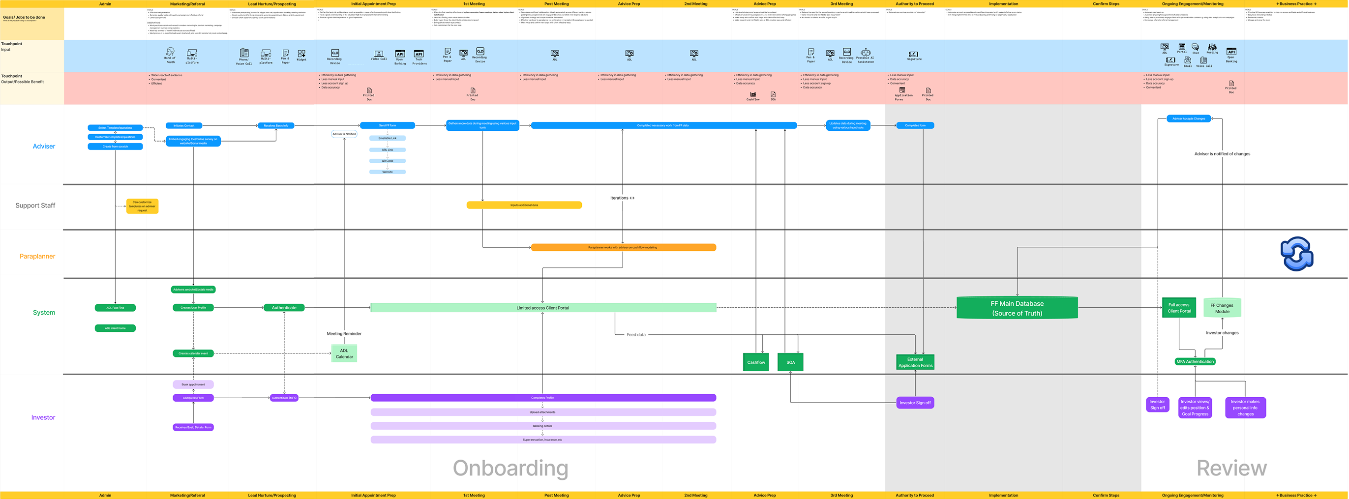
While talking to our users, we wanted to understand the true impact of the Fact Finder. By mapping how and when financial advisers use it, we uncovered something eye-opening, this tool isn’t just a step in the process; it’s embedded at every stage of financial advice.
Adviser Expectations Changed Over Time
As financial advisors increasingly rely on digital tools, their expectations have evolved. What once worked—static forms and tables—now feels clunky, slow, and outdated. With exposure to modern, intuitive applications, advisors now expect effortless, seamless workflows that keep up with their pace. But our current system? It lags behind, creating unnecessary friction instead of enabling efficiency.
“To stay relevant and valuable, we needed to rethink the experience—not as a digital form, but as a smart, frictionless platform that works for them, not against them.”
It isn’t just a tool—it’s advisers first impression
Before a meeting even happens, this module shapes how advisers perceive and prepare for the client conversation.
Source of truth for downstream modules
Tool isn’t just a data collection form—it’s the foundation for every financial decision within the platform.
Ripple Effect
Digging into the data revealed major inefficiencies. Almost every adviser had to do extra documentation, manually fill in gaps, or rely on third-party tools just to make the system work. This was far from the seamless, integrated experience they expected.
"The inefficiency wasn’t just frustrating— it had real business costs, leading to lost productivity and missed opportunities.”
Prolonged Meetings
Advisers spend extra time clarifying financial data instead of focusing on strategy.
Extra Documentation
Manual workarounds are needed to fill gaps in missing or unclear data.
3rd Party Tool Usage
The tool’s inefficiencies forced advisers to rely on third-party tools like xplan, myprosperity— leading to increased operational costs.
Increased Support Dependency
The tool’s inefficiencies forced advisers to rely on third-party tools like xplan, myprosperity— leading to increased operational costs.
Define Success
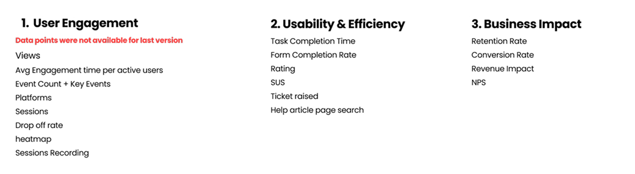
Measuring the Experience
Before designing, We tracked key metrics like task success rate, completion time, SUS, and Single Ease Question. We also analyzed support tickets, past conversations, and user feedback. Digging into the data revealed some big insights. It took 60-90 min to complete an onboarding of new investor with minimum fields entry with 30% completion rate. 1.1k ticket was raised in a month.
“...how might we help advisers & investor to engage better?”
The solution
Introducing Investor Profile
By bridging gaps in data clarity and engagement, we empower advisers to focus on what truly matters, building trust and driving smarter financial decisions.
Streamlined Data Access
By redesigning it from the ground up, we’ve brought what’s relevant – personal details, asset & liability, income & Expense, insurance, goal, real-time status, and personalised actions at a glance. Everything is a one-tap way.

Visuals to engage better
Transforming text-heavy data into clear, visual narratives helped advisers engage clients more effectively.
Impact: This helped boost average engagement time from 1m 20s to 4m 25s. The longest active session we recored was 45mins

Profile status
Allowing users to stay informed and help them to complete the missing pieces.
Impact: Increasd completion rate of profiles from 35% to 89%.
360 View
Uplifting our users life with clients' relevant information put right at a glance, fast to scan, and easy to understand.
Insights
To empower our user to make informed decisions by identifying any gaps or suggesting better approaches in financial decision-making.
Impact: This helped boost average engagement time.
Fixing the Basic
Onboarding required 20 different forms, turning a crucial first step into a frustrating bottleneck. Cutting steps wasn’t enough—we needed a smarter, more intuitive approach.
Our approach:
Auto-fetching data to eliminate redundant manual entry.
Adaptive forms that dynamically adjust based on user type and context
Progressive disclosure to surface only what’s necessary at each step
Pre-filled responses from past interactions for a seamless experience
Deep integrations with financial databases for accuracy and compliance
Behind the Scene
Engagement & Collaboration for Exceptional UX
We talked to our Stakeholders,SME, CSM, Support & Design team to understand their perspectives, gaps in application & business objectives. This also helped us to validate our team assumptions, enhance collaboration, create user-centred solutions, reduce rework costs, gains support for the final product, and to identify constraints and opportunities. This approach fostered a collaborative environment and ensured successful product that did meet both user needs and business goals.
Discovery & Alignment: Held kickoff workshops to understand business goals, technical constraints, and strategic priorities. This also built shared understanding of the product
Research & Insights: Shared user research findings and insights, to ensure their questions were answered and increased buy-in for insights.
Ideation & Concepting: We ran co-creation workshops with stakeholders and asked each participant to propose at least one solution. This approach encouraged divergent thinking, generated multiple ideas, and fostered a collaborative environment where everyone felt heard and involved.
Design & Prototyping: We shared iterative designs during sprint reviews to keep everyone aligned on our progress. Additionally, we scheduled extra check-ins to gather timely feedback and ensure the designs were moving in the right direction.
Validation & Delivery: We did not just shared the findings of our all three user testing, we also invited them to attend atleast one user testing session. Our goal was to give stakeholders confidence in the release
Post-Launch Reflection: Atul (Product Manager) began sharing the metrics (metrics defined in the early phase of the design) and data points after the release in each srpint review and monthly product showcase.
User Interface Elevation
Building for the Future, Not Just the Fix
By 2020, it was obvious — Morningstar Wealth’s products were showing their age. Designed in a different era (2013–2017), they no longer met the demands of today's users or scale.
I created scalable design patterns, page templates, and a dedicated design system for Morningstar Wealth.
Now, every new module and every refactor moves faster, feels unified, and stands ready to grow with the business.

Testing Our Assumptions
We conducted testing at three critical stages of the design process:
Wireframe Testing (Early Validation)
Objective: Validate the information architecture, page layout, basic interaction flows and data sets. Key Findings were:
Navigation Challenges: Users struggled to locate key actions like 'Add New Investor' and 'Update Financial Goals
Data Management Confusion: Users found it unclear how to edit or update investor details.
Collaboration Gaps: Difficulty in sharing updates with investors in real-time.(out of scope)
High-Fidelity UI Testing (Refinement)
With more refined visuals and interactions, we gathered deeper usability insights.
Cognitive Load Issues: Sections like Investment Preferences were information-heavy and overwhelming.
Customization Needs: Advisers wanted flexibility to prioritize the information they cared about.
Risk of Chaos: Too much exposed analytics at once was causing confusion rather than insights.
Beta Release (Pilot Testing)